

Flight-sharing platforms are designed for individual travelers. Jumper explores what a tool designed to organize trips for people departing from different cities but wanting to travel together to the same destination might look like.
· CONTEXT ·
Jumper is a personal project that arose from a simple need: to make it easier to organize group trips when each participant is traveling from a different city. The goal was to design an experience that would allow users to coordinate flights, schedules, and reservations all in one shared space.
THE CHALLENGE
JUMPER: PRODUCT DESIGN FOR COORDINATING GROUP TRIPS
UX Research · Information Architecture · User Flows · Wireframing · UI Design · Prototyping
· UNDERSTANDING THE USERS ·
The research revealed that the main issue wasn’t booking flights, but coordinating people. Users found it difficult to compare options, synchronize schedules, and maintain a shared view of the trip without relying on messages, screenshots, or scattered conversations.
Both families and groups of friends needed to see in one place who was traveling, when they were arriving, and what still needed to be done to finalize the plans.
· FLOW DESIGN ·
The flow was designed to transform a fragmented process into a shared experience.
Creating the trip served as the starting point. From there, each participant could search for flights from their home city while seeing how they aligned with the rest of the group’s options. The interface allowed users to compare schedules, identify conflicts, and check the status of reservations without leaving the trip context.
The goal was to reduce the time spent coordinating and to facilitate collective decision-making.
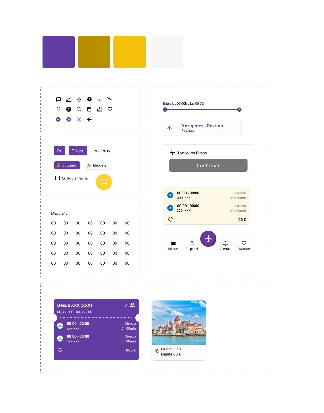
· DESIGN SYSTEM ·
The complexity of the product did not lie in the process of booking flights, but rather in the amount of information that needed to be displayed simultaneously. For this reason, the system was designed to facilitate comparison and decision-making within a group context.
The visual components prioritized the quick identification of participants, booking statuses, schedule conflicts, and pending actions. Consistency between individual and group views allowed users to switch contexts without having to relearn the interface.
The system included reusable patterns for calendars, flight comparisons, participant cards, and travel statuses, ensuring a consistent experience even as the number of travelers increased.
· CONCLUSIONS ·
Jumper allowed me to work on a design challenge that focused specifically on information architecture and coordination among users.
The tests conducted showed that visual clarity had a direct impact on the group’s ability to organize itself. Improvements such as simplifying the participant view, reinforcing the information hierarchy, and making it easier to switch between individual and group views significantly increased understanding of the system.
The main conclusion was that, in this context, designing for groups involves designing for shared visibility: each user needs to understand their own journey, but also how their decisions affect the whole.
· NEXT STEPS ·
Automatic flight recommendations tailored to the entire group.
Collaborative tools for voting on dates, times, or budgets.
Customization of the experience based on each participant’s role.
Validation with real groups of varying sizes to assess the product’s scalability.