
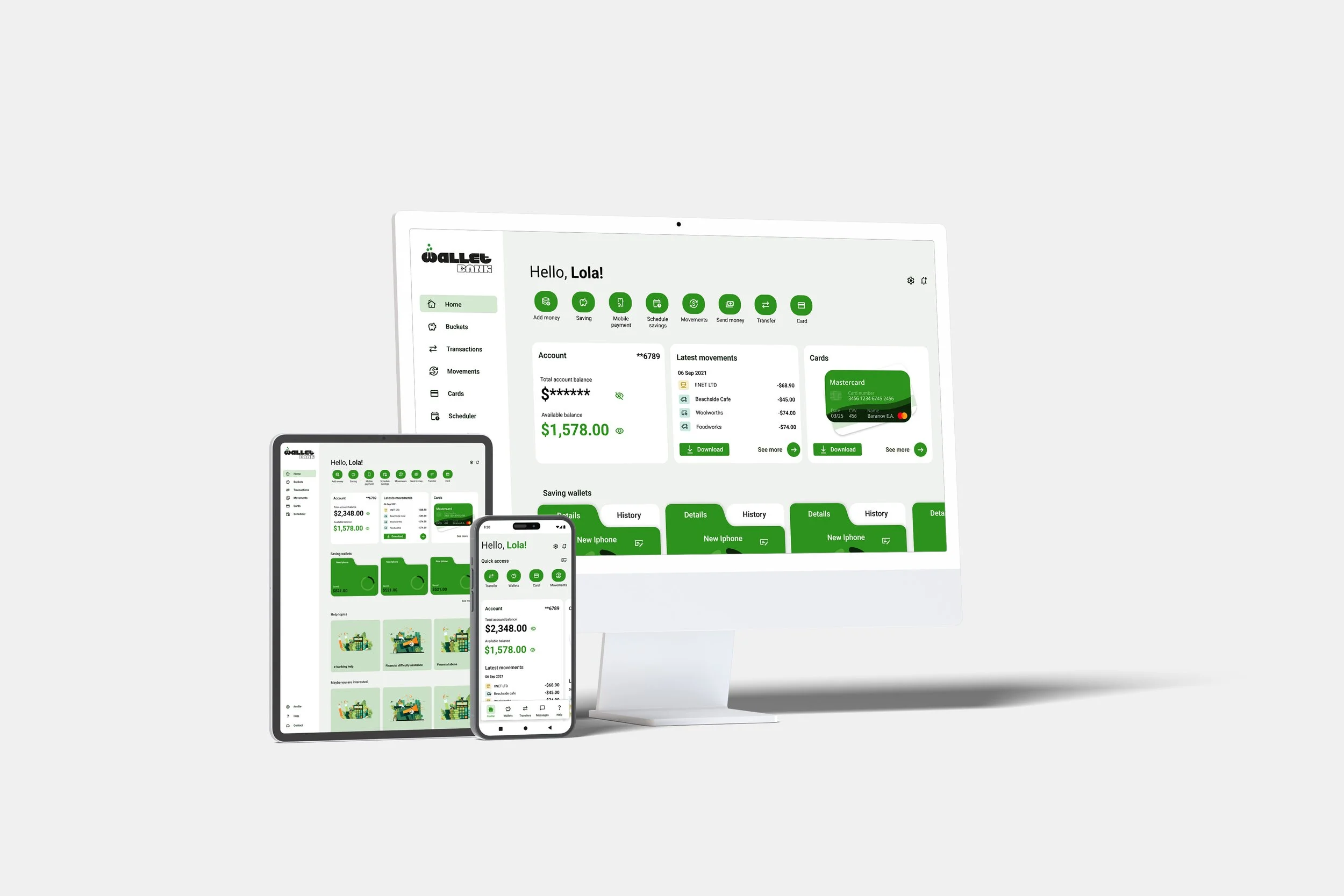
· WALLETBANK ·
MOBILE APP · BRANDING · UX/UI · FLOW DESIGN · PROTOTYPING
CONTEXT
The research revealed a common need: to clearly understand how much money they could spend and how much was set aside for savings. Users frequently checked their transaction history and wanted more control over how their funds were allocated among different goals.
This led to a focus on a highly visual interface where the available balance, savings, and allocation rules were easy to view and adjust at any time.
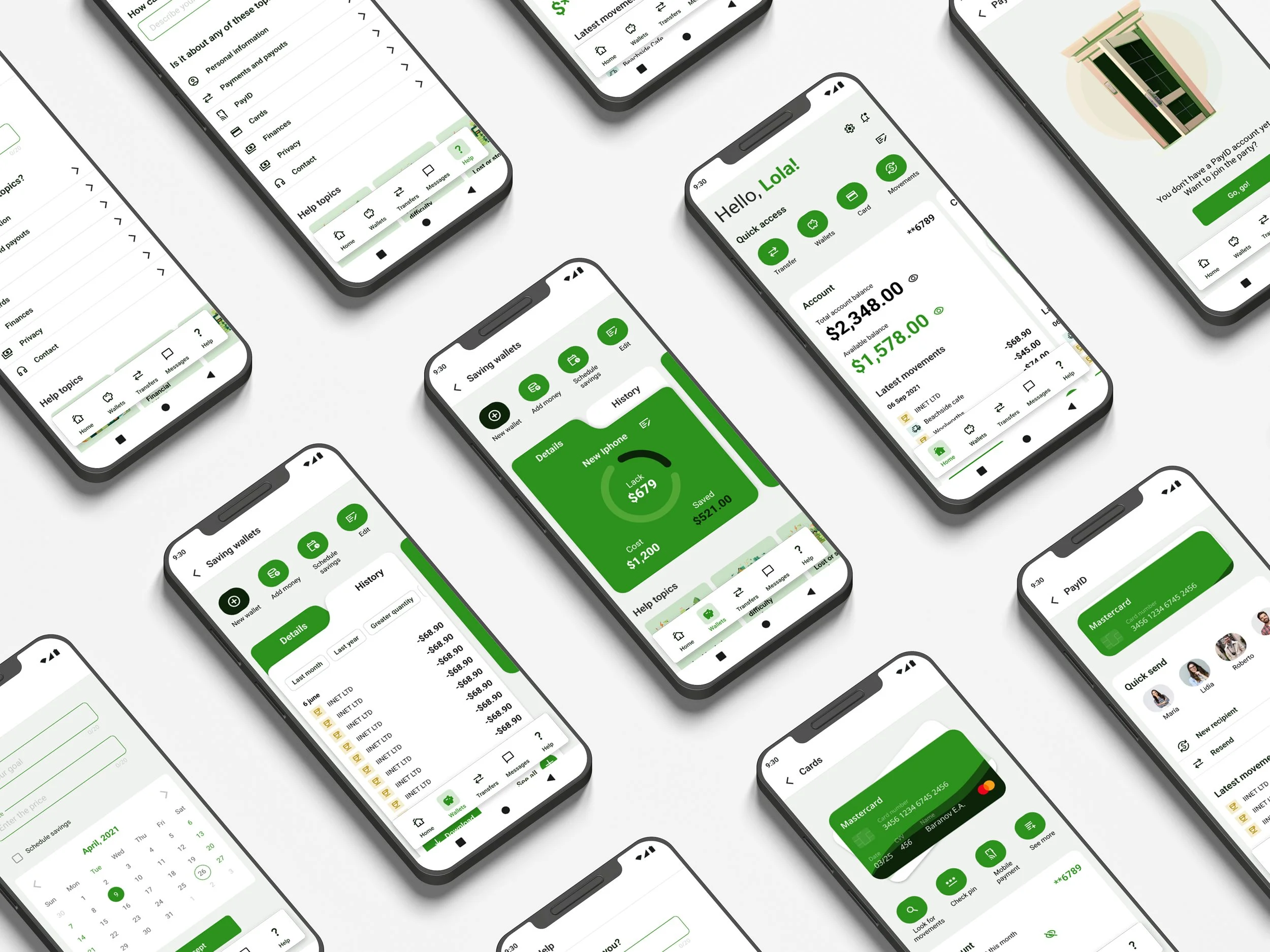
The research revealed a common need: to clearly understand how much money they could spend and how much was set aside for savings. Users frequently checked their transaction history and wanted more control over how their funds were allocated among different goals.
This led to a focus on a highly visual interface where the available balance, savings, and allocation rules were easy to view and adjust at any time.
PROBLEM & APPROACH
UNDERSTANDING THE USERS
The initial approach did not give much prominence to wallet management and limited users’ ability to adapt the tool to their financial habits.
Beyond designing new screens, it was necessary to rethink the product’s structure, define a distinct identity, and build a design system that would help users quickly understand which actions were available and how to perform them.
LESSONS LEARNED
DESIGN DECISIONS
UX FLOW
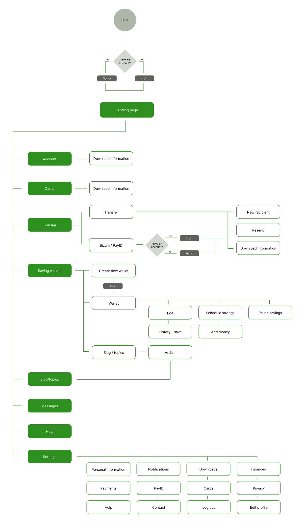
The workflows were reorganized to reduce steps and keep the financial context visible throughout the user journey. Each task focused on a single main action, with quick access to wallet status, customization options, and related features. The home screen served as the entry point to all key areas of the app.
DESIGN SYSTEM
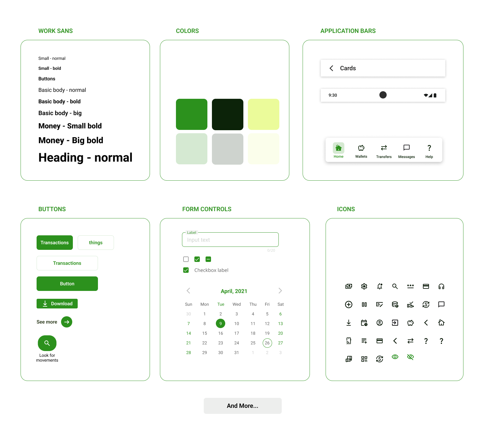
The design system was a strategic component of the project. The app required users to quickly identify where to check, transfer, or save money, so visual consistency had to facilitate learning and reduce uncertainty.
The identity was built around a palette of vibrant greens that broke with the usual conventions of digital banking. The goal was not to stand out through aesthetics, but to create a recognizable brand that conveyed calm, control, and trust.
The system included colors, typography, iconography, components, alerts, and reusable patterns that ensured a consistent experience throughout the app.
CONCLUSIONS
RESULTS
Wallet Bank ultimately became a comprehensive product design exercise, where research, information architecture, user flows, branding, and the design system all had to work together to solve a single problem.
Testing showed that seemingly small improvements—such as editing a wallet or seeing at a glance how much money was available to spend—had a direct impact on users’ sense of control and trust.
The project reinforced a key idea: when designing for different financial habits, flexibility is just as important as simplicity.
FUTURE IMPROVEMENTS

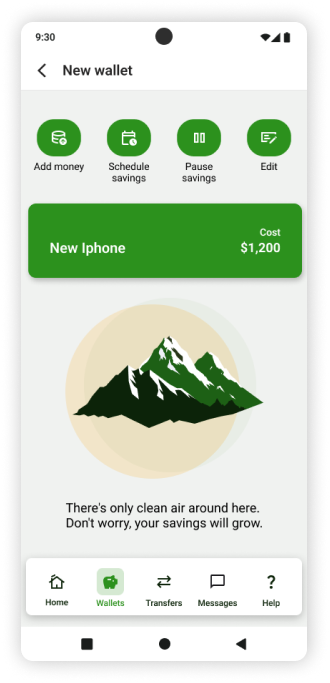
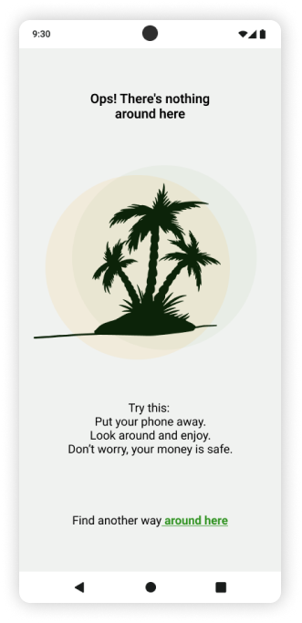
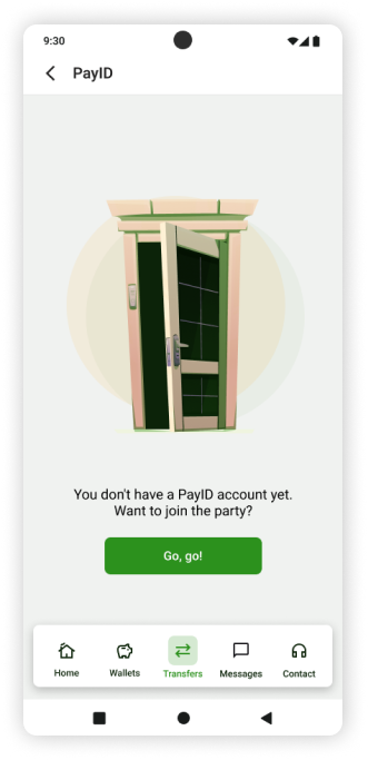
Future iterations could include savings recommendations based on actual usage habits, new visualizations to provide an immediate overview of one’s financial situation, and more advanced customization options for different user profiles.
It would also be beneficial to expand the scope of testing to validate the solutions with a more diverse sample of users.